

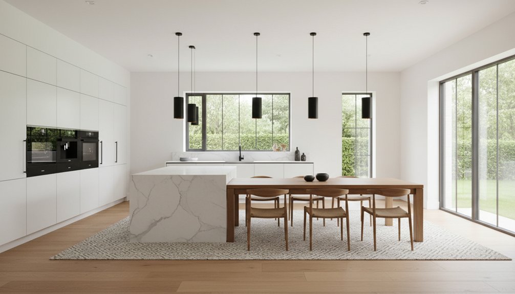
Start by removing visual and traffic barriers—bulky islands, tall cabinets, awkward finish changes—and map clear walkways with enough chair pull-out space. Choose one shared focal point and aim seating toward it to keep sightlines open. Repeat key finishes (one dominant metal, consistent wood tone, similar sheen) and carry 2–3 colors across both zones. Unify lighting with matching fixtures and 2700–3000K bulbs on dimmers, then anchor the dining table with a low-pile rug. Next, add a slim “in-between” console to bridge the seam.
Key Takeaways
- Remove visual barriers and bottlenecks by adjusting islands, cabinets, and walkways so light, views, and conversation flow between zones.
- Create a shared focal point, like a pendant or artwork, and orient seating and furniture toward it to maintain clear sightlines.
- Repeat finishes and colors across both areas—one dominant metal, consistent wood tones, and 2–3 shared colors—to reduce visual separation.
- Use coordinated lighting layers with matching fixture styles and 2700–3000K bulbs on dimmers to unify task and dining moods.
- Add an “in-between” connector piece, such as a slim console, aligned to counters or chair backs to bridge function and style.
Diagnose What’s Separating Kitchen and Dining

Before you start knocking down walls or buying new furniture, pinpoint what’s really breaking the flow between your kitchen and dining area. Stand at key sightlines and note what interrupts them: tall cabinets, bulky islands, or abrupt ceiling drops. Identify any partition walls that block light, views, or conversation, even if they don’t fully enclose the space.
Track how finishes change—flooring, paint, backsplash, or countertop edges—because hard boundaries can read like visual barriers. Check lighting layers: mismatched color temperatures or isolated fixtures can split the room in two. Listen, too—loud appliances or echoing surfaces may push people apart.
Once you know the true separator, you can target a fix that stays cohesive and space‑savvy.
Plan Walkways Between Kitchen and Dining
Map a clear circulation path between your kitchen and dining area so movement stays direct and predictable.
Size your walkways for comfort, giving people enough room to pass while chairs pull out and doors swing.
Then cut traffic bottlenecks by shifting islands, tables, or storage that pinches the route.
Define Clear Circulation Paths
Even if your kitchen and dining area share an open layout, you’ll feel cramped fast if people can’t move through it without detours. Map the main routes first: entry to fridge, sink to table, cooktop to serving zone. Keep those lines direct, and you’ll protect Spatial flow even when the room’s busy.
Use the island, table, or a console as “edges” that guide traffic instead of letting it spill everywhere. Face stools away from the primary route, and align chair pull-outs so they don’t block passing.
Place frequently used items—plates, glasses, napkins—on the dining-side path to reduce cross-traffic. If you’ve got doors or sliders, plan a clean lane to them. You’ll make both areas feel intentionally connected, not accidentally shared.
Size Walkways For Comfort
Clear routes only work when they’re wide enough for real life, so size your walkways between the kitchen and dining area for comfort, not just code. Aim for a pathway width that lets two people pass without turning sideways, and widen it where you’ll often carry plates, groceries, or a high chair.
Keep extra clearance space at the ends of runs so you can pivot smoothly from prep to table. If you’re planning an island or peninsula, measure from the counter edge to the nearest dining chair pulled out, not tucked in.
Leave enough room to open appliances, slide chairs back, and still walk through. Tape the layout on the floor and test it with a loaded tray before committing.
Remove Traffic Bottlenecks
When the kitchen and dining area share the same corridor, you’ll feel every pinch point during prep, serving, and cleanup. Fix it by mapping your most common trips: fridge to sink, sink to cooktop, cooktop to table, and table to dishwasher. Then clear a direct route that doesn’t cut through work zones.
Keep major paths open by shifting stools, narrowing an island overhang, or relocating a trash pullout that blocks doors. If two people pass often, create a bypass around the island or along a wall.
Use rugs, lighting, or a change in flooring direction to define spatial boundaries without adding barriers. Aim for smooth Traffic flow by keeping corners open, minimizing door swings, and placing serving items closer to the dining side.
Pick One Focal Point for Both Zones
To connect your kitchen and dining area, pick one focal point that both zones can share so the layout feels intentional. Anchor it with shared lighting and repeat one statement piece—like a bold pendant or art—so your eye reads the spaces as one.
Then align key furniture toward that focal point to keep sightlines clean and the room flow tight.
Anchor With Shared Lighting
Although the kitchen and dining area serve different tasks, they’ll feel like one intentional space if you anchor both with a shared lighting focal point. Center a statement fixture on the visual midpoint between island and table, or align two coordinated pendants on the same axis so your eye reads one continuous line.
Choose a dimmable source that gives an ambient glow for meals, then layer task lighting where you prep and plate. Keep color temperature consistent across zones (around 2700–3000K) to avoid a choppy look.
Hang pendants 30–36 inches above the surface and scale them to the room’s width so they don’t crowd circulation. Add a single switch or scene control to unify the mood.
Repeat One Statement Piece
Shared lighting sets the mood across kitchen and dining, but a single repeated statement piece locks in that “one-room” read even more. Choose one bold element and echo it in both zones so your eye keeps traveling without a hard stop.
Try repeating a sculptural vase shape (large on the dining table, smaller on the island), a distinctive metal finish (aged brass pulls and matching candlesticks), or a standout material like fluted wood (paneling on the island, a slim wall shelf nearby). Keep the scale proportional: one hero, one supporting repeat, no clutter.
Limit the palette to two to three tones so the motif feels intentional, not themed. This simple duplication builds visual harmony and makes the transition feel seamless, even in tight footprints.
Align Furniture Toward It
When you anchor both the kitchen and dining area to a single focal point—like a fireplace, a standout range wall, or a large window—you stop the space from feeling split.
Then commit to visual alignment: point seating, lighting, and circulation lines toward that feature so both zones read as one.
Start with furniture arrangement. Angle bar stools and the island’s main working side toward the focal point, not toward the entry.
Place the dining table so its long axis aims at the same view, and center the chandelier on that line.
If you use a rug, align its edges with the table and island to reinforce direction.
Keep a clear path between prep and seating, and you’ll get connection without crowding.
Match Metal, Wood, and Hardware Finishes
To make your kitchen and dining area feel like one intentional space, line up your metal, wood, and hardware finishes with a simple, repeatable plan. Pick one dominant metal (brass, black, or nickel) and use it on 60–70% of visible pieces—cabinet pulls, faucet, chair frames, or a bar cart—then add 30–40% secondary metal accents for depth without clutter.
Next, echo wood textures across the boundary: if your cabinets run warm oak, choose a dining table in a similar undertone, or repeat that tone in open shelves, stools, or a sideboard. Keep sheen consistent—either mostly matte or mostly polished—so transitions feel smooth.
Finally, cap it at two metals and two woods to avoid visual noise.
Use Lighting to Unify Kitchen and Dining
Even if your finishes match, lighting often decides whether the kitchen and dining area read as one zone or two separate rooms. Start by choosing fixtures that share a finish, scale, or shape language, then repeat that cue on both sides of the space.
Build layered illumination: recessed or a slim flush-mount for general light, under-cabinet strips for task work, and a statement pendant centered over the table. Keep color temperature consistent (2700K–3000K) so everything feels like the same environment.
Put key circuits on dimmers to shift from prep brightness to an ambient glow at dinner without changing fixtures. If your ceiling heights differ, use adjustable stems or semi-flush options to align visual weight and keep sightlines clean.
Define the Dining Zone With a Rug
Where do you want the dining area to “land” in an open kitchen-dining layout? Use an area rug to set that boundary without building walls. Size it so all chair legs stay on the rug when pulled out; that keeps movement smooth and prevents snagging on the edge.
Anchor the rug under the table, centered on the light fixture above, and leave a consistent walkway to the kitchen work zone. Choose a low-pile, easy-clean material that can handle crumbs and chair traffic.
For color coordination, pull one tone from nearby finishes—like cabinet paint, countertop veining, or wood flooring—so the dining zone reads as intentional, not dropped in. A subtle pattern also hides spills and scuffs.
Repeat 2–3 Colors Across Both Spaces
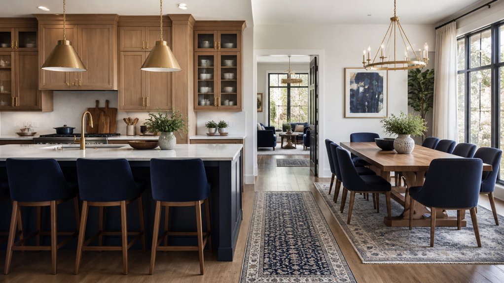
If you repeat just two or three colors across the kitchen and dining area, the whole layout reads as one connected space instead of two zones competing. Pick a base neutral, then add one or two accents you’ll echo on both sides for Color harmony and visual continuity.
Use the neutral on large surfaces: cabinetry, walls, or the rug border. Carry an accent through small, flexible items: barstools, dining chairs, linens, art, or pendant shades.
Match undertones, too—warm whites with brass and oak, cool grays with chrome and ash—so finishes don’t clash. Keep the ratio consistent: let one color dominate, one support, one punctuate.
You’ll control the palette, reduce visual noise, and make sightlines feel smoother from prep to plate.
Add an “In-Between” Piece to Connect Areas
Because open layouts can feel visually “floaty,” you’ll get a cleaner, more intentional connection by adding an in-between piece that belongs to both zones. Choose something that functions for prep and dining: a slim console behind chairs, a narrow island extension, a bar cart, or a low open shelf.
Place it on the seam line where the kitchen ends and the table begins, then align its height with nearby counters or chair backs for visual flow.
Keep finishes consistent with one key element from each area—cabinet hardware plus dining legs—so it reads as a bridge, not a third style.
Use it to store placemats, servingware, or a small lamp. You’ll create spatial harmony without adding bulk.
Conclusion
When you make your kitchen and dining area feel connected, your whole home acts like it’s twice the size. Start by fixing the “invisible wall”: clear walkways, share one focal point, and keep metals, woods, and hardware in the same family. Layer lighting that talks across both zones, anchor the table with a rug, and repeat two or three colors everywhere. Add one in‑between piece, and the spaces practically high‑five.