

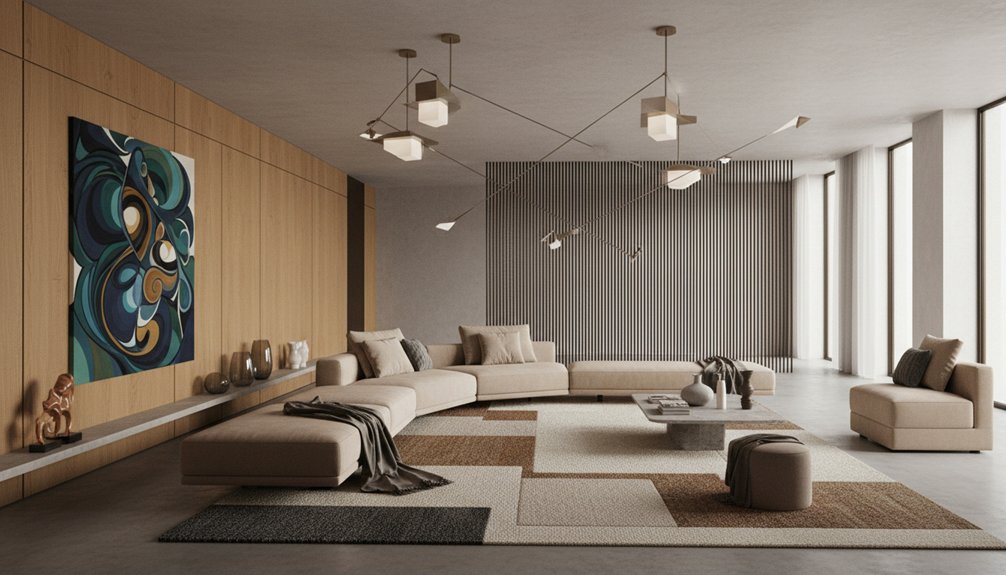
You start conceptual interior design by picking one clear idea that guides layout, circulation, light, and materials, so every sightline feels intentional. Map your daily routes—entry drop zone, kitchen-to-dining flow, work and quiet corners—then choose a concept that supports those behaviors. Build a mood board with real finish samples and color chips to lock in undertones. Set rules for one wood tone, one metal, layered lighting, and edited accents. Keep going to see how to apply it room by room.
Key Takeaways
- Start with one guiding concept that informs layout, circulation, light, materials, and proportions to reduce visual noise and mismatches.
- Map daily routines and routes to define zones, sightlines, entry points, and storage needs before choosing furniture or finishes.
- Develop a mood board translating the concept into cohesive colors, textures, and materials, checking undertones and contrasts with real samples.
- Optimize flow by sizing furniture to the space, keeping primary paths clear, and testing layouts with tape for door swings and clearances.
- Set rules for palette, materials, and layered lighting—ambient, task, accent—using consistent wood/metal tones, dimming, and color temperatures.
Define Conceptual Interior Design (and Why It Works)

While traditional decorating often starts with individual pieces, conceptual interior design begins with a clear idea that guides every choice. You define an intent—calm, energy, clarity—then translate it into layout, circulation, light, material, and proportion, so the room reads as one coherent experience.
This approach works because it prioritizes Spatial interpretation: you map how you move, where you pause, what you see on entry, and how sightlines connect zones. You also support Artistic expression through consistent forms, textures, and color relationships that feel deliberate, not accidental.
When you make decisions from the concept, you reduce visual noise, avoid costly mismatches, and keep budgets aligned with priorities. You end up with spaces that fit you precisely and perform beautifully.
Choose a Conceptual Interior Design Concept for Your Lifestyle
How do you choose a concept that actually fits the way you live, not just the way you want a room to look? Start by mapping your daily routes: entry drop zone, kitchen-to-table flow, work corner, and the quietest spot for recovery. Notice where you pause, where you rush, and where clutter gathers.
Then choose a concept that supports those behaviors—open sightlines for social cooks, layered zones for hybrid work, or enclosed nooks for deep focus. Anchor decisions in Personal expression: what you collect, how you host, what calms you.
Weave in Cultural influences through rituals, meals, and seating habits so the layout respects them. Finally, test the concept against storage capacity, lighting needs, and acoustics.
Mood-Board Your Concept: Finishes, Furniture, and Feel
Once you’ve picked a concept, translate it into a mood board that tells you exactly what the space will feel like at eye level and at hand level: the sheen of the paint in afternoon light, the grain direction of the wood underfoot, the weight of the sofa silhouette against the wall.
Pull finish samples you can touch—plaster, oak, brushed metal, linen—and pair them to test Textural contrast without guessing. Keep color chips beside each material so undertones stay consistent across rooms.
Add furniture references that match your daily use: deep seat depth for lounging, slimmer arms for circulation, or a higher back for support. Sketch quick vignettes showing furniture placement relative to windows and focal points, so proportions read right.
Edit ruthlessly until every swatch reinforces the same mood, not just a trend.
Apply Conceptual Interior Design to Layout and Flow
Your mood board sets the look and tactile mood; now make the plan move the same way. Start by mapping your daily routes: entry to drop zone, kitchen to dining, sofa to media, bed to bath. Keep primary paths clear and sized to your stride so circulation feels intentional, not accidental.
Use space optimization to assign each zone a job, then right-size it—don’t overscale seating or undersize storage clearances. Test furniture arrangement with tape on the floor: confirm door swings, drawer pulls, and walk-around space at chairs and beds.
Align focal moments with approach lines so you see what matters first. Create buffer zones at *passageways*, and cluster functions to reduce backtracking. Your concept becomes a lived sequence, not just a look.
Set Concept Rules for Color, Materials, and Lighting
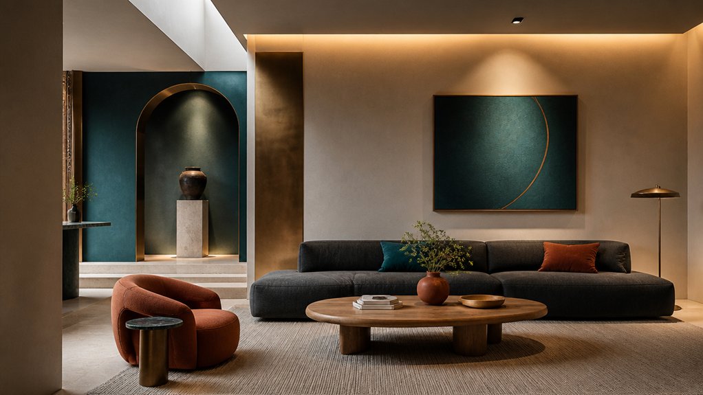
Now you’ll set clear concept rules that keep every room visually connected as you move through the space. Define a color palette with a tight range of core tones and controlled accents so your walls, trims, and key sightlines read as one cohesive composition.
Then standardize materials and lighting—repeat finishes at touchpoints and layer ambient, task, and accent light—so the textures and brightness stay consistent with how you want the space to feel.
Define Color Palette Rules
Although the concept sets the mood, you lock it in by defining clear rules for the color palette, material finishes, and lighting temperature so every room reads as one cohesive environment.
Start with a tight base: one dominant neutral and two supporting tones that move with sightlines from entry to core spaces. Specify where saturation may appear—art walls, niches, or built-ins—so the eye lands intentionally, not randomly.
Use Color harmony to keep gradation calm across thresholds, then introduce shade contrast to shape depth: darker values to anchor long corridors, lighter values to widen compact rooms, and midtones to connect open-plan zones.
Document ratios (60/30/10), sheen limits, and allowable undertones, so your client can shop confidently without drifting off-concept.
Standardize Materials And Lighting
A disciplined color palette holds the mood, then consistent materials and lighting make it feel believable from room to room. Set clear rules for where each finish appears: one wood tone for casework, one metal for hardware, and a controlled stone family for wet areas. This Material consistency keeps sightlines calm and progression intentional as you move through doorways and around corners.
Map lighting as a layered system, not a fixture list. Define ambient levels, task placements, and accent aims, then repeat beam spreads and color temperature across zones. You’ll get lighting harmony that supports how you live: brighter at prep surfaces, softer at seating, and glare-free along circulation.
Specify dimming, trim colors, and fixture scale so ceilings read continuous and your concept stays coherent.
Style It Naturally (and Avoid Common “Staged” Mistakes)
Once your concept rules are set, you’ll style the space with natural layers—textiles with real texture, a few well-worn objects, and greenery placed where the eye already pauses.
You’ll skip obvious props and instead build real-life vignettes that live: a reading corner with a reachable lamp and current book, a tray that actually holds keys by the entry.
When every item earns its spot through use and proportion, the room reads intentional, not staged.
Natural Layers Over Props
When you layer a room the way you actually live in it—rather than “placing” props—you create depth that reads effortless from every sightline.
Start with what the space needs: a chair that turns toward conversation, a side table within reach, a reading light aimed where your eyes land.
Then build Layered textures intentionally—linen against leather, nubby wool underfoot, matte ceramic near reflective glass—so the room feels finished without feeling fussy.
Bring in Organic elements that belong there: a branchy stem in a heavy vessel, a stone bowl for keys, a wood tray that corrals remotes.
Keep spacing breathable; leave negative space so circulation stays clear.
Edit anything that blocks a path, crowds a surface, or competes with your focal view.
Real-Life Vignettes That Live
Although a styled surface can photograph well, a vignette that truly lives has to work from every angle and hold up to your daily habits. Start by mapping sightlines from the doorway, sofa, and kitchen pass-through, then keep the footprint clear so you can set down keys, tea, or mail without reshuffling objects.
Anchor the grouping with one sturdy piece (tray, bowl, or book stack), then add one breathable vertical element that won’t poke your eye line. Choose items you actually use: a lighter, coaster, reading glasses, a small lamp.
Let Artistic expression show through a single artwork or sculptural object, not five. Weave in Cultural influences via textiles, ceramics, or heirlooms, and leave negative space to reset fast. Daily.
Conclusion
When you design concept-first, you’re not just picking pieces—you’re mapping a life in three dimensions. You’ve chosen a north star, built a mood-board like a compass, and let layout carry you from entry to escape. Your rules for color, materials, and light keep every corner speaking the same language. Now style with restraint: leave breathing room, keep surfaces lived-in, and let the space hold you, not perform.