

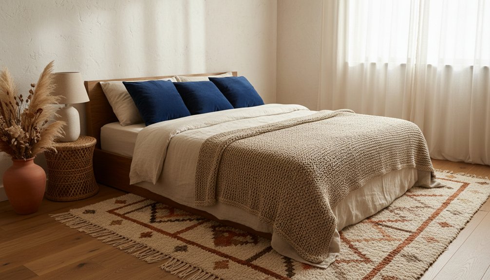
Give your bedroom personality by choosing 3–4 textures and balancing sheen: aim for 70% matte, 30% gloss, with one satin in between. Use the “soft + structured” rule—crisp percale sheets with a relief-stitched quilt, then a nubby throw. Mix pillows in smooth cotton and bouclé, and add warm wood grain or cane for linear contrast. Ground it with a plush wool rug, then layer warm 2700–3000K lamps to sculpt it all. Keep going for easy pairings and quick fixes.
Key Takeaways
- Mix matte and gloss finishes for contrast, aiming for about 70% matte and 30% gloss with one satin midpoint.
- Follow “Soft + Structured”: pair fuzzy or nubby textiles with crisp wood, smooth lacquer, or tightly woven fabrics.
- Layer bedding—crisp sheets, a stitched quilt, and a textured throw—then mix pillow sizes and weaves for depth.
- Add wall and floor texture with a plush rug, slatted wood or molding, or limewash/grasscloth on one feature wall.
- Use warm layered lighting (2700K–3000K) to highlight surfaces, repeating key textures twice so the room feels intentional.
Pick 3–4 Textures for Your Bedroom

Build Textural contrast by varying sheen and scale: matte textiles against crisp-grain wood, fine weave beside chunky knit.
Nail Material pairing by repeating each texture twice—lamp shade to throw, frame to hardware—so it reads intentional, not random.
Use the “Soft + Structured” Texture Rule
Use Tactile contrast on purpose: pair a fuzzy pillow with a tightly woven rug, or a nubby ottoman against smooth lacquered nightstands.
Keep proportions in check by repeating structure in at least two spots (bed frame + bench, or dresser + side tables) so softness reads intentional, not messy.
Then refine with consistent lines: squared edges with squared, curves with curves.
That’s how you get Visual harmony without losing warmth.
Layer Sheets, Quilts, and Throws
While your bed already anchors the room, layered bedding gives it the tactile depth that makes it feel styled instead of flat. Start with crisp percale or silky sateen sheets to set the base hand-feel, then add a quilt for midweight dimension.
Choose matelassé, channel-stitching, or kantha-style quilting so light rakes across the surface and highlights relief.
Finish with a throw at the foot: nubby bouclé for a modern note, brushed mohair for haze, or a chunky knit for sculptural heft. Keep your palette tight, then lean into texture pattern mixing—pair a subtle stripe sheet with a crosshatch quilt, or a linen weave with a waffle throw.
This nods to bedroom texture trends without looking busy or overdone.
Mix Pillow Textures for Contrast
You’ll get instant contrast when you pair smooth cotton or silk shams with nubby bouclé, linen, or knit pillows.
Build the stack by layering sizes and shapes—oversized squares in back, lumbar in front, and a small round or bolster to break the grid.
Keep the palette coordinated, then let texture carry the variation so the bed reads intentional, not busy.
Balance Smooth And Nubby
Even if your color palette stays calm, mixing smooth and nubby pillow textures instantly adds depth to the bed. Start with a sleek cotton or linen sham as your base, then introduce a bouclé, knit, or slub-weave cover to create Texture contrast that reads rich but restrained. You’ll feel the difference before you see it, which is the point of tactile layering.
Keep the smooth pieces crisp and tightly woven so they reflect light, and let the nubby ones absorb it for a soft, dimensional finish. If a pillow looks too busy, move the texture to the reverse side or choose a tone-on-tone weave.
Finish with one refined detail—piping, micro-fringe, or a stitched seam—to sharpen the mix.
Layer Sizes And Shapes
Because scale changes how texture reads, layer pillow sizes and shapes to make each fabric earn its place. Start with two oversized Euro shams in a tight weave as a calm backdrop, then add standard pillows in a plush, higher-pile textile to build layer contrast without visual noise.
Bring in shape variety to sharpen the composition: a lumbar pillow in ribbed velvet or chunky knit anchors the centerline, while a small round cushion in boucle or faux fur breaks the grid and softens edges. Keep seams, piping, and tufting intentional; those micro-details amplify texture under bedside light.
Stagger depths so loftier pieces sit forward and flatter weaves recede, giving your bed a sculpted, tactile silhouette.
Coordinate Colors With Texture
Once you’ve nailed the mix of pillow sizes and shapes, let color steer how each texture shows up on the bed. Build Color harmony by keeping two or three core hues consistent across materials, then vary the weaves: matte linen, nubby bouclé, slick sateen, and a touch of velvet. When tones match, the tactile differences read as intentional, not busy.
Use Texture contrast to create depth: pair a smooth, light-reflective pillow in a midtone with a chunky knit in the same shade family. If you want bolder definition, shift value instead of hue—cream velvet against oat linen, charcoal wool against graphite cotton.
Finish with one small accent pillow in a saturated color, but keep its fabric distinctive so it earns attention.
Add Bedroom Texture With an Area Rug
Anchor your bedroom with an area rug that feels as good as it looks—think plush wool, tufted cotton, or a deep-pile shag that softens every step.
You’ll get instant dimension when you layer a smaller patterned rug over a larger neutral base, letting edges peek out like a tailored border.
Keep the pile heights and weaves intentionally varied so the floor reads rich, not busy.
Choose Plush Rug Materials
While you can add texture with almost any area rug, plush materials deliver the most immediate, touchable impact underfoot. A Plush rug instantly softens hard floors, muffles sound, and makes the room feel more cocooned, especially beside the bed where you step first.
Your material selection matters: wool brings resilient loft and a naturally rich, matte sheen; mohair and alpaca read airy and refined, with a subtle halo. For a sleeker plush, try viscose or bamboo silk, but place it where traffic stays light since it crushes easier.
High-pile nylon or polyester offers durability and stain resistance for busy bedrooms. Check pile height, density, and backing—dense fibers feel fuller, shed less, and keep footprints from looking messy.
Layer Rugs For Depth
If your bedroom needs more dimension than a single rug can deliver, layering gives you instant depth and a more collected, tactile look. Start with a larger, flatter base—jute, sisal, or a low-pile wool—then angle a smaller, plusher rug on top to frame the bed. Let edges peek out by 8–12 inches so the contrast reads intentional.
Mix textures, not competing patterns: a nubby base under a vintage-inspired, faded motif works every time. Keep the top rug slightly off-center to break symmetry and add movement.
Echo the feel elsewhere with textured wall treatments and layered fabric accents, so the room’s surfaces build a cohesive, touchable story. Use a rug pad to prevent shifting.
Warm Up the Room With Wood and Rattan
How do you make a bedroom feel instantly warmer without piling on color? Reach for Wood accents and Rattan furniture, then let their grain and weave do the talking. Start with a walnut or oak nightstand, a slatted headboard, or picture ledges that add linear texture at eye level.
Mix finishes—matte, oiled, or lightly wire-brushed—so the room feels layered, not matchy.
Bring in rattan through a cane-front dresser, a woven bench at the foot of the bed, or a sculptural pendant shade. Its open pattern keeps the look airy while adding tactile depth.
Balance these natural textures with crisp bedding and a few ceramic pieces, and you’ll get warmth that reads intentional and tailored.
Choose Curtain Fabrics That Add Softness
Even in a neutral bedroom, the right curtain fabric can soften hard lines and make the light feel creamy instead of stark. Start with Curtain fabric choices that feel tactile: linen for a dry, relaxed hand; cotton voile for airy diffusion; brushed twill for quiet coziness; velvet for weight and hush.
Hang panels high and wide so they puddle slightly or just kiss the floor, adding a tailored drape that reads intentional.
Build Soft fabric layering with a sheer behind a heavier panel. You’ll get daytime privacy without losing glow, then richer calm at night. Choose a subtle slub, herringbone, or basket weave to add dimension up close.
Add a simple cloth tape header or pinch pleats for controlled folds.
Mix Matte and Glossy Finishes (Without Glare)

While a bedroom thrives on calm, a smart mix of matte and glossy finishes gives it depth without turning it into a light show. Use Matte finishes on large, flat planes—your headboard, nightstands, or dresser fronts—so surfaces read velvety and quiet under evening lamps.
Then layer Glossy finishes in smaller, curved, or detailed accents that catch light in controlled sparks: a lacquered tray, ceramic lamp base, polished metal pulls, or a glass carafe on the nightstand. Keep shine out of your direct sightline from the bed, and aim reflective pieces toward soft, shaded light sources instead of bare bulbs.
Balance ratios: roughly 70% matte, 30% gloss, so the room feels tailored, not flashy. Add one satin midpoint to bridge both.
Add Wall Texture With Paint, Panels, or Peel-and-Stick
After you’ve balanced matte and gloss, give the room a bigger tactile backdrop by building texture into the walls. Start with paint techniques: color-wash for a soft, linen-like haze, limewash for cloudy movement, or a suede-effect finish for plush depth. Keep the palette tight so the surface reads, not the hue.
For instant dimension, add panels—slatted wood, beadboard, or thin box molding—scaled to your ceiling height. Paint them one tone to emphasize shadow lines, or slightly shift sheen for subtle relief.
If you rent or want speed, peel-and-stick Wall treatments bring convincing grit: grasscloth prints, plaster-look sheets, or ribbed vinyl. Wrap a single wall behind the bed, then keep adjacent walls calmer so the texture feels intentional, not busy.
Use Lighting to Make Textures Stand Out
You can make every texture in your bedroom read richer by layering ambient lighting, so woven linens, matte paint, and paneled walls don’t fall flat. Add accent lights—like a swing-arm sconce or a slim picture light—to graze key surfaces and highlight their grain, pile, or ribbing.
Then aim light with intention to create crisp shadow play, because direction turns subtle texture into high-contrast depth.
Layered Ambient Lighting
Because texture lives and dies by shadow, layered ambient lighting becomes your easiest tool for making materials read with depth. Start with a soft ambient glow from a dimmable ceiling fixture or cove lighting, then add a secondary wash through lamps or a shaded pendant to avoid flat, overhead glare.
This light layering creates gentle gradients across linen, boucle, rattan, and plaster, so their weave and grain show up without harsh hotspots. Choose warm temperatures (around 2700K) to keep fibers looking rich, not gray.
Use diffusers, fabric shades, or frosted bulbs to smooth gradation, and place lights at different heights to vary shadow direction. Put everything on a single dimmer scene so you can tune contrast nightly.
Accent Lights For Texture
Where can texture really flex in a bedroom? Right where your eye lands first: the headboard, nightstands, and any tactile art. Use accent lighting to skim across a boucle headboard, a ribbed ceramic lamp base, or grasscloth wallpaper so every loop and ridge reads crisp, not flat.
Choose adjustable picture lights, mini spotlights, or slim LED bars mounted under shelves to target specific materials without flooding the whole room. Warm-white bulbs (around 2700K) keep wood grain honeyed and linens buttery, while high-CRI LEDs preserve true color in woven pieces.
Put dimmers on each accent so you control intensity and avoid glare. This is texture enhancement that makes even simple fabrics feel custom and layered.
Shadow Play With Direction
When light hits texture from the side, shadows do the heavy lifting, carving depth into everything from linen weave to fluted oak. Aim for directional lighting instead of flat overhead glow: swivel a reading sconce to rake across a quilt, or angle a plug-in spotlight toward a plaster wall. You’ll get crisp shadow contrast that makes ridges, slubs, and grain read like relief.
Place lamps low and off-center to elongate shadows on a boucle headboard or cane nightstand. Keep bulbs warm but not dim; too soft and texture collapses. Add a dimmer so you can tune the beam—tight for drama, wider for calm.
Even a simple bedside pendant, hung slightly forward, can sculpt your bedding into layered topography at night.
Style Textured Decor on Nightstands (3-Item Formula)
Even if your bedroom palette stays calm and minimal, your nightstand can carry serious personality through texture. Build a textured bedside moment with a tight three-item formula: height, glow, and tactility.
Start with something vertical—a ribbed ceramic lamp, a fluted glass vase, or a slim stack of linen-bound books—to set the silhouette.
Add a warm, reflective element like a hammered brass tray or smoked-glass candle to catch light and echo shadow play.
Finish with a touchable piece: a woven lidded box, pebble-shaped stone coaster, or nubby bouclé catchall.
Keep spacing intentional so each surface reads. This layered nightstand looks curated, not crowded, and it stays practical for nightly essentials too.
Use Texture to Cozy Up Small Bedrooms
In a small bedroom, three well-chosen textures can make the space feel warmer without adding visual clutter. Start with a plush foundation: a low-pile rug that slips under the front two-thirds of the bed to soften every step without crowding pathways.
Add a touchable mid-layer with a quilted coverlet or nubby linen duvet; keep it in tight color palettes so the room reads calm, not busy.
Finish with one crisp contrast—slatted wood, matte ceramic, or brushed metal—on a lamp base or picture frame to sharpen the scheme.
Use furniture placement to protect breathing room: float slim nightstands, choose an upholstered headboard instead of bulky art, and keep curtains floor-length for vertical softness.
The result feels cocooning, streamlined, and intentional.
Refresh the Bedroom With Seasonal Texture Swaps

Small bedrooms thrive on restraint, and that same edited approach makes seasonal texture swaps feel fresh instead of fussy. Keep your core pieces consistent—headboard, rug, nightstands—then rotate only the touchable layers that change the room’s mood fast.
For winter, trade crisp percale for brushed cotton or linen, add a chunky knit throw, and bring in a matte ceramic lamp base for soft light.
In spring, lighten with a quilted coverlet, a nubby bouclé pillow, and a woven basket that reads airy but grounded.
Summer likes slubby linen sheets and a lightweight gauze throw; fall welcomes velvet shams and a wool-blend blanket.
Aim for Texture contrast: smooth + napped, glossy + matte. Let Seasonal decor live in textiles, not clutter.
Bedroom Texture Mistakes to Avoid (and Quick Fixes)
You can accidentally smother your bedroom’s personality by piling on too many textures, so edit to a few standout surfaces with clear contrast and breathing room.
If the space feels stylish but still cold, you’re likely missing warmth and softness—layer in tactile textiles like a plush throw, padded headboard, or nubby rug to balance harder finishes.
And when everything reads flat, your lighting’s the culprit, so add angled lamps or warm dimmable bulbs to rake light across fabrics and let every weave and grain show.
Overloading Too Many Textures
Although layering textures brings depth and warmth, piling on too many competing finishes can make a bedroom feel visually noisy and restless. An overwhelming variety—ribbed ceramics, chunky knits, high-gloss lacquer, faux fur, rattan, velvet—can read like a sample board instead of a composed room, especially when clashing patterns fight for attention.
Edit with intention: pick one dominant texture, two supporting textures, and one accent with contrast. Repeat each at least twice (a boucle chair echoed in pillows) to create rhythm. Limit patterns to one hero print plus a quiet secondary, and keep scales distinct.
If your nightstand, headboard, and dresser all “speak,” mute one with a matte finish or a solid textile. You’ll keep richness without chaos.
Ignoring Warmth And Softness
When a bedroom leans too hard on sleek surfaces—painted drywall, crisp percale, glass-topped nightstands, polished metal—everything reads cool and a little sterile, no matter how good the layout is. You feel it immediately: the room looks finished, but it doesn’t invite you to exhale.
Fix it by layering warmth where your body lands and grazes. Swap one sharp element for something tactile: a brushed cotton duvet, a washed linen sham, or a velvet lumbar pillow. Add a wool or tufted rug that softens footsteps, then anchor the bed with a padded headboard or quilted coverlet.
Bring Textural contrasts through matte ceramics, raw wood, and a nubby throw. These shifts create sensory stimulation without clutter, turning “sleek” into “restful.”
Flat Lighting Hides Texture
Even with a room full of beautiful materials, flat overhead lighting can iron out every nuance, leaving linen, boucle, and wood grain looking oddly one-note. You end up with texture concealment: piles read smooth, slubbed weaves look plain, and carved details disappear into glareless sameness.
Fix it by layering light like you layer textiles. Swap a single ceiling fixture for dimmable sources at different heights: a warm bedside lamp with a fabric shade, a wall sconce that grazes the headboard, and a low floor lamp aimed across a rug.
Use directional bulbs to rake light over surfaces, not wash them. Add a soft LED strip behind a floating shelf to pull out grain and shadows. Keep color temperature consistent, around 2700K–3000K.
Conclusion
You’ve now got the tools to give your bedroom real personality through texture—without visual clutter. Stick to 3–4 key finishes, balance soft with structured, and keep layering: crisp sheets, a quilt, a nubby throw, and pillows with contrast. Ground it all with a rug, then style nightstands with a simple three-piece mix. Swap textures seasonally for instant refresh. Remember: the devil’s in the details—edit, adjust, and let touchable depth do the talking.