

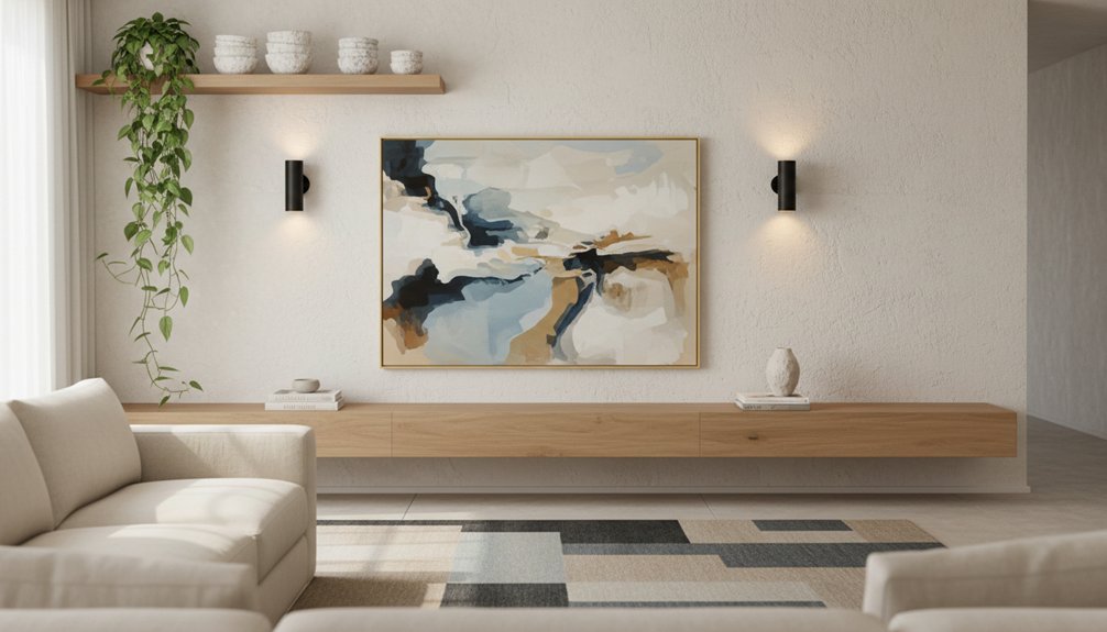
Start by choosing one focal wall—sofa or TV—so the room doesn’t feel split. Anchor it with oversized art (at least two‑thirds the furniture width) or a tight, well-spaced gallery grid with consistent frames. Add depth with limewash or crisp color blocking on that single hero wall, then keep adjacent walls tone-on-tone. Boost light with a large mirror facing a window and balanced plug-in sconces. Keep going for shelves, molding, and wallpaper moves.
Key Takeaways
- Pick one focal wall (TV or sofa) and keep the other quieter with tone-on-tone paint or slim shelving.
- Add an accent treatment like wallpaper, mural, or panel molding to define a zone and create instant architectural interest.
- Hang one oversized artwork at least two-thirds furniture width, centered around 57 inches high, to anchor the blank wall.
- Build a cohesive gallery wall using a grid plan, consistent spacing, and a controlled frame-and-mat palette for a polished look.
- Use a large mirror opposite a window or lamp, and add sconces or picture lights to brighten, expand, and layer the wall visually.
Choose the Right Living Room Focal Wall (Sofa vs TV)
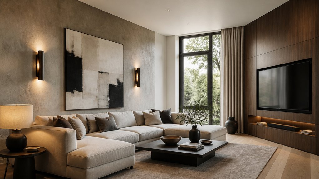
Before you pick paint, paneling, or art, decide which wall should lead the room—your sofa wall or your TV wall—because that choice controls sightlines, furniture layout, and where the eye lands first.
If your sofa faces the entry, make that backdrop do the heavy lifting: center the sofa, anchor it with a rug, and frame it with symmetrical lighting for visual balance.
If the TV wall dominates daily use, treat it like cabinetry, not a black rectangle—float a low console, hide cords, and keep surrounds matte to reduce glare.
For focal point selection, choose one hero wall and keep the other quieter with tone-on-tone color or slim shelving.
You’ll get a room that feels intentional, not split.
Plan a Gallery Wall Layout That Looks Cohesive
Whether you’re mixing family photos, prints, and small objects, a cohesive gallery wall starts with a clear grid logic and consistent spacing, not random “fill the blank” hanging. You’ll get the cleanest result by mapping the wall first: trace frames on paper, tape templates up, then adjust until sightlines feel balanced from the sofa.
Lock in color coordination early—repeat two to three tones across art and mats so the collection reads as one composition. Then control frame styles: commit to one finish for a tailored look, or mix two finishes in a strict ratio (like 70/30) to keep contrast intentional.
Aim for 2–3 inches between pieces, align top or center lines, and keep the outer edges squared to the room’s architecture.
Hang Oversized Wall Art for Instant Scale
A gallery wall gives you rhythm and variety, but one oversized piece can set the room’s scale in a single move. Choose Oversized art that’s at least two-thirds the width of your sofa or credenza, so it reads intentional, not floating. Hang it with the center at eye level (about 57 inches) and keep it 6–8 inches above furniture to create a clean visual tether.
For Scale balance, match the frame’s weight to your room: thin profiles for airy spaces, deeper frames for grounded, architectural rooms. If you’re tight on square footage, skip bulky mats and use a slim float frame to maximize image area.
Anchor the composition with a focused palette that echoes a rug tone or accent pillow, then let the piece do the heavy lifting.
Add Paint Texture With Limewash or Color Blocking
When you want depth without adding clutter, paint texture gives your living room wall a layered, architectural finish. Try limewash for a soft, chalky movement that shifts with daylight and hides minor wall flaws. Keep it refined by limiting it to one focal wall and choosing muted neutrals or mineral tones.
If you prefer graphic structure, use color blocking to define zones behind a sofa, console, or reading chair. Tape crisp edges, then paint a large rectangle or arch that’s wider than the furniture to anchor it visually.
Choose two related hues—one base, one accent—so the room still feels open. These texture techniques add dimension, guide the eye, and make a blank wall look intentionally designed without adding a single object.
Use Wallpaper or a Mural to Define the Space
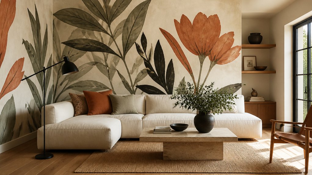
Because a bold wall treatment can do the work of furniture, wallpaper or a mural, it instantly defines your living room’s “zone” without stealing floor space. Use it behind the sofa to anchor seating, or wrap a reading corner to signal a destination.
Choose scale with intent: oversized botanicals calm small rooms, while tight geometrics sharpen long, narrow walls. Treat it like a palette—pull one color into pillows and a throw so Pattern mixing feels curated, not chaotic.
For renters, try peel-and-stick panels framed by negative space to keep things breathable. If you prefer subtlety, use a tonal mural with soft gradients; it adds depth without noise.
Reserve high-contrast prints for accent walls, and keep adjacent walls quiet for balance.
Add Molding or Paneling for a Finished Look
Choose a paneling style that fits your room’s scale—slim shiplap can elongate, while square box panels add tailored structure without visual clutter.
Plan your molding layout with clean, consistent spacing and align it to key lines like ceilings, windows, and furniture heights for a crisp, built-in look.
Finish with paint—match for subtle depth or go tonal-contrast to sharpen the architecture and polish the whole wall.
Choose Paneling Style
Although paint can do a lot, paneling and molding give your living room walls a finished, architectural edge that reads intentional even in a small space. Start by choosing a style that matches your home’s bones and your scale: slim picture-frame molding for airy apartments, shaker-style box paneling for calm structure, beadboard for cottage warmth, or applied grid paneling for modern rhythm.
Consider historical influences—Georgian symmetry, Craftsman honesty, or Art Deco geometry—then edit them to feel current. Your material options matter: MDF stays crisp and budget-friendly, solid wood brings depth and durability, and veneer panels deliver a seamless, high-end plane without bulk.
Keep profiles shallow to protect walkway clearance and reduce visual weight.
Plan Molding Layout
Once you’ve landed on a paneling style, map the layout with the same care you’d give furniture spacing. Start by identifying the focal point—fireplace, media console, or main seating wall—then center your grid or frames around it. Measure ceiling height, baseboard thickness, and outlet locations so stiles don’t land awkwardly.
Use painter’s tape to mock up rails and boxes at full scale, stepping back to check wall symmetry from the entry and sofa. Keep margins consistent: equal top and side reveals read tailored, while wider lower panels ground the room.
Align verticals with window casings, door trim, and major furniture edges to avoid visual clutter. Finally, plan seams and corner returns so patterns wrap cleanly, not abruptly.
Finish With Paint
After you’ve dialed in the molding or paneling layout, paint locks the whole composition together and makes it feel built-in rather than tacked on.
Start by deciding whether you want the trim to disappear or pop: paint molding and wall the same shade for a calm, space-stretching effect, or shift sheen and tone to sharpen the relief. Tie your color palette to existing anchors—rug, sofa, art—so the new geometry reads intentional, not busy.
Use eggshell on field areas for clean wipeability, and semi-gloss on trim for crisp edges. Caulk seams, fill nail holes, sand lightly, and prime patched areas so your wall finishing looks seamless under daylight and lamps.
Keep ceilings lighter to lift the room visually.
Install and Style Living Room Wall Shelves
When you need display space without sacrificing square footage, living room wall shelves deliver function and style in one clean move. Place them where they’ll work hardest: above a console, flanking a fireplace, or over a reading chair.
Choose Floating shelves for a seamless, gallery-like line, or use Decorative brackets when you want a crafted, architectural edge.
Install with intention: hit studs when possible, or use heavy-duty anchors rated for your load. Keep shelf depth proportional—8 to 10 inches suits most living rooms without feeling bulky.
Style in tight groups, not clutter: stack two books, add a low bowl, then finish with one vertical piece for height. Repeat materials (wood, brass, black) across shelves so the wall reads cohesive, not collected.
Living Room Wall Ideas for Small, Dark Rooms (Mirrors + Sconces)
Because small, dark living rooms need light to travel, start with mirrors and sconces that amplify what you already have instead of adding visual bulk. Hang an oversized mirror opposite a window or lamp to bounce brightness deeper into the room; choose a thin metal frame to keep edges crisp.
If you’ve got one blank wall, try a pair of vertical mirrors to visually raise the ceiling line. For lighting enhancements, flank your focal art or sofa with hardwired or plug-in sconces; aim for uplight-plus-downlight shades to wash the wall evenly.
Keep color schemes tight: warm whites, pale greige, or muted clay make shadows softer, while matte finishes hide glare. Add a small picture light to give depth without clutter.
Conclusion
Now you’ve got a clear game plan to turn that blank living room wall into a designed moment. Anchor the space with the right focal wall, then build cohesion with a gallery layout or one oversized piece. Layer in finish—limewash, color blocking, wallpaper, or a mural—then sharpen the edges with molding or paneling. Add shelves styled with intention, and brighten small, dark rooms with mirrors and sconces. Why settle for empty when every inch can work harder?