


You’ll mix patterns and fabrics like a pro by starting with a tight palette and a simple 3-pattern rule: one hero print, a secondary pattern at half scale, and a subtle texture. Keep motifs distinct, but repeat one color across every layer for cohesion. Add solids—ivory, greige, soft clay—as “rest zones” between bold prints. Contrast textures (crisp percale, slubby linen, plush velvet) and limit shine to small accents. Next, you’ll see easy layering formulas that always work.
Key Takeaways
- Use a 3-pattern rule: one hero pattern, one medium pattern at half scale, and one subtle texture to prevent visual chaos.
- Keep patterns cohesive by repeating one base color across sheets, duvet, pillows, or curtains, then add a complementary accent for contrast.
- Vary scale and motif type: pair one organic print with one geometric, and avoid competing motifs of similar size and intensity.
- Balance bold patterns with solid “rest zones” like a neutral duvet, plain shams, or calm wall color to keep the room relaxing.
- Mix fabrics intentionally: combine crisp cotton or percale with linen or knits, and add small velvet accents for depth and light-catching detail.
Start With a Simple 3-Pattern Rule

If you’re not sure where to start with pattern mixing, use a simple 3-pattern rule to keep the bedroom layered but not chaotic. Choose one “hero” pattern for impact—like a bold duvet or statement rug—then add a secondary pattern at half the scale, such as striped shams.
Finish with a subtle, textural pattern—think micro-check, herringbone, or tone-on-tone jacquard—on a throw or lumbar pillow.
Nail Pattern pairing by varying scale, not competing motifs. Anchor the look with repeating one element (a line weight or shape) across all three.
For Fabric mixing, balance sleek and cozy: crisp cotton percale, matte linen, and a touch of velvet or bouclé to catch light. Keep solids between patterns so everything breathes.
Pick a Bedroom Color Palette First
Before you mix patterns, pick a tight bedroom color palette by choosing one base hue you’ll repeat across key textiles.
Then layer in complementary colors—think a muted accent and a richer contrast—so prints feel coordinated, not chaotic.
Keep it current by balancing warm and cool tones, like creamy neutrals with inky blues or terracotta against sage, to create depth without visual noise.
Start With A Base Hue
Where do you even start when you’re mixing patterns and fabrics in a bedroom? Start with a base hue that anchors everything else, so your prints don’t compete. Pick one dominant color from a fixed element you love—an area rug, upholstered headboard, or painted walls—and treat it as your visual “home base.” This creates Color harmony across materials like linen, velvet, and cotton, even when their textures shift.
Next, let that hue show up in multiple places at different intensities: a solid duvet, piping on pillows, or a throw blanket.
Then introduce Pattern contrast by varying scale within the same hue family—think a large plaid with a tighter stripe—so the room feels layered, not loud. Keep finishes consistent for a modern, collected look.
Build With Complementary Colors
Once you’ve locked in that base hue, build out a bedroom color palette with complementary colors that bring energy without turning the space into visual noise. Use the color wheel to pick a true opposite or a near-complement for a softer, more livable hit.
Then repeat that accent in at least three places—pillow piping, a throw, and artwork—so it reads intentional and supports color harmony.
Keep your patterns inside that palette, but vary scale to sharpen pattern contrast: pair a large botanical duvet with a mid-scale stripe and a tight geometric on cushions. Anchor the mix with solid fabrics in the base hue, and let the complementary color show up in smaller, higher-impact doses like lampshades, trim, or a rug border.
Balance Warm And Cool
How do you keep a pattern-heavy bedroom feeling layered rather than chaotic? You balance Warm hues with Cool tones before you pile on prints. Start by choosing a temperature “leader” for the room—say, warm terracotta walls or a camel quilt—then add a cooler counterpoint like slate, eucalyptus, or ink. This push-pull keeps florals, stripes, and geometrics from competing because the palette does the organizing.
Repeat your warm-cool mix in each zone: a brass lamp beside a blue-gray shade, rust pillows against crisp white sheets, or an ochre throw on a charcoal bench. Keep undertones consistent (golden warms, blue-based cools), and let one temperature dominate at about 70/30 for a modern, curated feel.
Choose a Hero Print for the Bedroom
To kick off a well-mixed bedroom, start by choosing one hero print that sets the tone and anchors every other pattern in the space. Your Hero print selection could be a bold floral duvet, a graphic rug, or statement drapery—pick the piece you’ll see most and love year-round.
Let its colors guide your palette, especially after balancing warm and cool tones. Then commit to Pattern dominance: keep this print visually primary and repeat one or two of its hues elsewhere for cohesion.
Check contrast at a distance and up close; the hero should read clearly from the doorway. Finally, match the print’s mood to your style—modern geometrics feel crisp, botanicals feel relaxed, and abstract motifs feel art-forward.
Mix Patterns by Scale (Large, Medium, Small)
Although color ties everything together, scale is what keeps a mixed-pattern bedroom from feeling busy. Start with your hero print in a large scale—oversized florals, bold geometrics, or wide stripes on the duvet or a feature curtain.
Then layer a medium-scale pattern nearby, like a ticking stripe, checker, or ikat on shams or a bench cushion to build Pattern harmony.
Finish with small-scale prints—pin dots, micro-gingham, or subtle botanicals—on sheets or a lumbar pillow, so the eye has a fine-grain rhythm to follow.
Keep motifs distinct: if the hero is organic, try a graphic medium print.
Use fabric contrast intentionally, pairing matte cotton with slubby linen or velvet to make scale shifts feel modern and deliberate.
Use Solid “Rest Areas” Between Bold Prints
Once you’ve balanced patterns by scale, give the room a few solid “rest areas” so those prints read as intentional instead of relentless. Build solid color zones where the eye can land: a crisp white duvet, a camel wool throw, or matte linen shams without contrast piping. These quiet surfaces sharpen your bolder pieces, making florals, geometrics, and stripes look curated rather than chaotic.
Treat big planes first. Keep walls, rugs, or drapery in restful neutral spaces like warm ivory, greige, or soft clay, especially in smaller bedrooms. Then add pattern in controlled bursts—an upholstered headboard, a lumbar pillow, a bench cushion—so each print gets breathing room.
Finish with textured solids (bouclé, velvet, washed cotton) for depth without visual noise.
Repeat 2–3 Colors Across Every Pattern
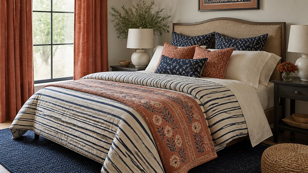
When you repeat just 2–3 colors across every pattern in the room, even wildly different prints start to feel like they belong together. Choose a tight palette—say warm ivory, inky navy, and a muted clay—and let it appear in your duvet print, pillow geometrics, and a small-scale stripe.
For smart Color coordination, pick one “anchor” shade at 60%, a secondary at 30%, and an accent at 10%. Then scan each pattern: if it carries at least two of your chosen colors, it earns a spot.
Keep undertones consistent (cool with cool, warm with warm) so nothing clashes. Pattern repetition doesn’t mean matching; it means echoing the same hues at different scales for a modern, layered look.
Mix Bedroom Fabrics for Texture (Linen, Knit, Velvet)
You’ll keep your bedroom feeling curated by pairing crisp linen with a soft knit, letting their contrast add quiet depth without changing your palette.
Start with linen sheets or a duvet, then layer in a knit throw or pillows to warm up the bed and soften the edges.
Finish with velvet accents—like a lumbar pillow or bench cushion—to catch light and add a polished, trend-forward note.
Balance Linen With Knit
Although linen reads crisp and airy, it can feel a bit stark on its own—so pair it with knit to soften the look and add lived-in texture. Start with linen sheets or a duvet cover for that relaxed, hotel-clean base, then layer a chunky knit throw at the foot of the bed to warm up the silhouette.
Add a knit lumbar pillow to break up the flatness without competing with any print. For balance, keep linen in lighter, matte tones and choose knit in slightly deeper hues or heathered yarns for visual depth.
You’ll also get practical benefits: linen’s breathability plus knit’s cozy stretch improves textile durability in high-touch spots. If you use patterned linen, rotate pieces to reduce pattern fade.
Accent With Velvet Layers
Because linen and knit skew matte and tactile, velvet makes the perfect accent layer to introduce sheen and a richer depth without overpowering the bed. Use Velvet layering strategically: add a jewel-tone lumbar pillow, a moody bolster, or a slim bench cushion to catch light and sharpen the room’s contrast.
Keep the pile plush but the scale tight so it reads intentional, not heavy. Accent with velvet in small, repeatable moments—two pillows plus a padded headboard panel, or a throw folded at the foot—then echo that color in a stitched detail or subtle stripe nearby.
Choose performance velvet for durability, and stick to one sheen level so it feels cohesive against airy linen and relaxed knit textures.
Balance Matte vs Shiny Finishes

When you mix patterns and fabrics in a bedroom, the finish matters as much as the print. Start with matte finishes as your base: washed cotton, brushed linen, and flat-weave wool keep busy motifs feeling calm and modern.
Then add shiny accents in controlled doses to catch light and sharpen contrast—think lacquered nightstands, satin lampshades, mirrored trays, or subtle metallic threads in a throw.
Keep sheen consistent within each zone: if your headboard area already leans glossy, balance it with chalky paint, ceramic, or boucle nearby.
Aim for one dominant finish, one supporting finish, and one small sparkle. You’ll get depth without glare, and every pattern reads clearly, especially under warm bedside lighting at night.
Layer Patterns on Bedding and Pillows
Start with the simplest layer—the sheets—and build pattern outward so the bed looks intentional, not chaotic. Choose a subtle base print like pinstripes, mini checks, or a tonal botanical in breathable cotton or linen.
Add a duvet with a larger-scale motif, then temper it with a solid quilt or matelassé coverlet so you don’t overwhelm the eye. These Pattern mixing techniques work best when you repeat one color across every layer.
Use Fabric coordination tips to keep textures consistent: crisp percale with structured shams, relaxed linen with slubby throws, velvet pillows for a modern hit of depth.
Mix one geometric, one organic, and one nearly-solid pattern. Finish with two lumbar pillows that echo the sheet color to tie it all together.
Add Pattern With Bedroom Curtains and Rugs
You’ll get an instant, pulled-together look when you coordinate your curtains and rug with a shared color note or complementary undertone.
Balance scale and motifs by pairing a bold, large-scale print on one with a tighter stripe, check, or subtle geometric on the other.
Then layer in depth with tonal color shifts and tactile textures—like linen curtains over a low-pile rug—so the patterns feel modern, not busy.
Coordinate Curtain And Rug
Although your bed often gets the spotlight, curtains and rugs do the heavy lifting for pattern in a bedroom, framing the room and anchoring the floor in one move.
Start by choosing a dominant element: if your Rug patterns are bold, keep Curtain fabric calmer but textured, like linen slub or a subtle herringbone, so the room feels curated, not chaotic.
If your curtains carry the print, pick a rug that echoes one color from the drapery and stays grounded in a tighter, low-contrast design.
Tie both pieces together with finish choices: match warm brass hardware to warm rug tones, or use matte black with cooler palettes.
Keep the backdrop cohesive by repeating the same accent color in trim, pillows, or art.
Balance Scale And Motifs
When you balance scale and motifs, your curtains and rug create rhythm instead of visual noise. Start by picking one “hero” pattern: maybe wide, airy stripes or a large botanical on the curtains.
Then anchor the floor with a smaller repeat, like a tight geometric or mini-check, so your eye can rest while still reading personality. Aim for scale harmony by keeping one pattern bold and one pattern finer, rather than competing midsize prints.
Use motif contrast deliberately: pair organic shapes with crisp lines, or traditional florals with modern grids, to look curated and current. If both pieces share a similar motif family, shift the scale drastically to avoid a matchy set.
Keep proportions consistent across the room’s sightlines.
Layer Colors And Textures
If your patterns feel a little flat, layer color and texture so the curtains and rug read as a designed set instead of two separate statements. Start with Color harmony: pull one quiet shade from the rug into the curtain fabric, even if the print scale changes. Then add a second accent in smaller doses—trim, tiebacks, or a border—to keep the palette intentional.
Next, build Texture contrast. Pair crisp linen or cotton curtains with a rug that has pile, boucle, or a flatweave with raised patterning. If your rug is busy, choose curtains with a subtle slub, tonal stripe, or stitched grid.
If your curtains are bold, ground them with a rug in a matte, nubby weave. Finish with a solid throw to bridge both.
Quick Fixes for Common Bedroom Pattern Mistakes
Even with a well-edited palette and a few favorite prints, bedroom patterns can start to clash the moment one piece pulls too much focus. For Pattern clashes, ground the room with a calm solid: swap in a matte duvet or fitted sheet, then let the prints live on pillows and a throw.
Tighten Fabric coordination by repeating one hue across three surfaces—curtains, rug, and lumbar—and matching finishes (linen with linen, velvet with velvet). If scale feels off, pair one large motif with one micro-print and one stripe; remove the “medium” that muddles.
Too many florals? Trade one for a geometric or textured weave. Finally, edit contrast: mute one print via a beige border or piping.
Conclusion
You’ve learned to mix patterns and fabrics without turning your bedroom into a “busy moment.” Stick to your three-pattern rule, anchor everything with a clear palette, and let one hero print do the talking. Vary scale, pause bold choices with solid rest areas, and balance matte with a touch of shine for that quiet-luxury finish. Layer bedding, then echo it in curtains and rugs. If something feels “off,” edit one piece and let the room exhale.